29 March 2011

self defined - new brief

I had a chat with Steve earlier who helped me a lot with my ideas and said how this brief really should be on something which I love as I can make it up by myself. After our discussion I was swayed towards designing the new album for one of my favourite bands and therefore designing their mechandise too. I have however decided against it as the sorts of illustration which would be appropriate just isn't my style.

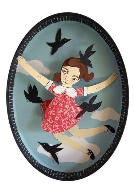
After the last brief of creating my own typeface and using a lot of paper collage I decided to look into this further. I came across these by Jayme McGowan. Reminded me of a modern version of Joseph Cornell's boxes. They are so creative and intricate. Created in boxes like an installation I love her style and want to develop on from this. She said the reason behind her work is due to her ever growing collection of paper which I can relate to as I've been collecting random scraps of paper no matter how small for years and is the reason why my art cupboards are so full and messy. I am not entirely sure if I will create something like this but I like the layering of colours to create something 3D. Here are a few of my favourites:


27 March 2011

my final type


and in context as it is aimed at video games..


some work from the sketchbook

Below are photographs taken from 3 pages in my sketchbook. I feel I may be getting somewhere with the circle letters and numbers as I believe it is an interesting take of type as to my knowledge this hasn't been done before. I need to now develop all the letters and numbers to make sure they are all readable and so that similar shaped letters and numbers like 'S' and '5' have a significant difference in shape. As I wanted to create my type so it was suitable for a computer game I think that using the bright coloured paper is more effective than the white as it shows excitement whereas white paper is dull and uninteresting.

23 March 2011

new type brief

The new one week brief is to design a type face from A-Z and numbers 0-9 based on one object. The audience needs to be considered so it could be for a campaign or a poster. Here are some interesting images I found below. My favourite ones are the jean typeface as it is so simple yet really effective. The jeans were just simply arranged and photographed. I also like the folded paper typeface for the same reason.


Below is a type that I really felt inspired by as I liked the mechanical look to it which I found in a book called 'The Typographic Experiment'. I have posted a few others too as I thought they were interesting and caught my eye. I love the african jewellery themed type 3 images down as it is so bold and colourful. The same with England made from type - a simple idea of making text larger and smaller in different areas works really well.


22 March 2011

graffiti: from tags to riches

I watched this programme last night on graffiti and although it's not got alot to do with my projects I thought I'd blog some of the awesome stuff I saw. These are by 'Sickboy'.


And my favourite:

website design


My personal website would work by the user clicking on an option on the menu on the left hand side. The images to choose from would appear as small thumbnails and they would click which image they wanted to view.

16 March 2011

final zine


how i made my zine

We were set a mini brief of 3 days to create a zine using 6 photographs using different processes to create a minium of 8 pages. I thought seeing as it was nearly Spring I would focus on the garden. As bees hibernate during the Winter and come out for Spring I thought of including their day to day routine into my zine.
Here were my 6 photographs:


I then cut up my 6 images to create 8 different ones by incorporating them into the text. I got this idea by looking at the book 'Type & Colour' and saw this image below. I thought it was interesting how the shape of Santa was made into really awkward shaped letters like the 'M':


A few photos of the process:


14 March 2011

final stamps

My final book of fashion stamps showing headwear from the 1920's to the 1970's:

some roughs from the sketchbook

Meant to upload this ages ago but had it saved as a draft ooops !
These are just some roughs when I was going along the idea of using fashion icons. However after a crit with Haydn it made me realise that the icon could draw attention away from the headwear. I only really liked the ones of Jean Shrimpton (pictures 3 and 4) as the block colour of the outfit and headscarf is bright and colourful. The images draw you to them which is what the stamps need to do due to their size.